I just got back from a nine day trip to Mexico City. It was my first time there and I was excited to visit the museums, palaces, churches, and see art by notable Mexican Artists like Frida Kahlo and Diego Rivera. Below are tiny segments I’ve played with in terms of color and gradation from murals by David Siqueiros. They were painted at Chapultepec Castle. I was most captivated by his brush strokes and the loose gestural movement of the lines and shading. As I was editing them, I was thinking of the the story behind the country and the people’s fight for independence.
The entire Castle was amazing to walk through. The artifacts left behind illustrated a lifestyle from another time. Traveling to countries (especially ones that were founded and developed hundreds of years before the United States) is like time traveling. It’s fun and exciting to think of life hundreds of years before yours and what it must have been like. Where would you stand? What would you do? How would you express yourself? I look forward to going through the many frames I took and sharing more thoughts and perspectives from when I was there. It’s definitely a city I want to go back to and visit.
At the end of last year, when I decided to embark on the journey of doing photography as a full-time hobby with the hopes of making some money, I knew I’d need to find a way to promote my work and myself. And I’ll be the first to say that I’ve been dipping my toe into the ocean of uncertainty and pulling it out just as quickly when I got scared to make my next move, of any kind. But soon enough, I got that opportunity to hang my work at Wheelhouse Coffee and the rolling ball could not be stopped. Of all the things to be nervous about, I was nervous about having a business card I could have available for people to take. After all, the idea of showing work is about sharing your work with the general public in addition to getting your name out there and circulating. That’s the hope, anyway.
After trying to design my own brand, I quickly realized I needed professional help. First of all, I was going crazy with the blahness I was coming up with, and I was being stubborn about doing it myself. Second, I knew I wasn’t going to be entirely happy with what I’d come up with. I simply don’t immediately have the skills to pull this off. I also read somewhere that it’s okay to reach out, ask for help, and expect to pay some money for it.
I called on my good friend Michael Harring to help explore my identity and design a business card for me. It’s tough when the main thing you have to do is think about yourself. To help with a starting place, he walked me through some mood boards. He presented three boards and it was like looking at myself. Each one carried awesome elements I identified with and just loved. I could not have been more excited about the direction he was going with this. And without further ado, this is my very cool business card.
Mike suggested using different photographs of mine to print on the back – little samples and take-aways. I chose six of my favorites and he cropped and oriented them to fit and flatter. I could not be more happy with this result. It speaks to my personality and my aesthetic so well.
The entire process was like a dream. Maybe it’s because we’ve known each other for so long and I have complete trust in his sensibilities, work ethic, and his sincerity to make sure I was happy with the final product, but I would not hesitate to call on him for future work. And even though we’re friends, I offered to pay for his work, because he is a working artist, and working artists should be paid.
And with that, I will shamelessly plug his portfolio: www.michaelharring.com. He is indeed a Creative Monster.
Recently, I watched a few live classes on composite and portrait photography. I went into the composite photography with the intention to learn about layering, and digital methods used. The portrait class I watched because it was about working quickly in a challenging setting (which can happen to anyone in any photography situation). There were plenty of tips, theories, tricks, and suggestions to take away from them, but it surprised me how much I paid attention to modeling. How are people twisting and turning their bodies to make it appear more upright, more balanced, or more elongated. Particularly, what were people doing with their hands? I think if you ever sat for a portrait, you know you have to contort your face, neck, and back somehow. But what do you do with your hands? What message do you want to convey to the person who will see the photograph? Strength, tenderness, wisdom, faith, hope, fashion?
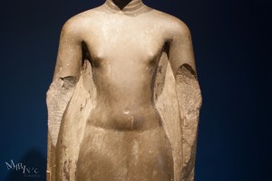
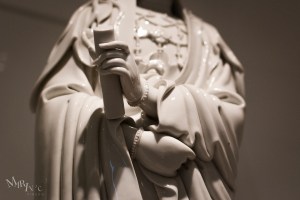
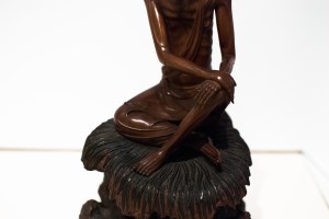
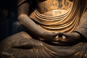
I recently visited the Seattle Asian Art Museum and started noticing how hands were positioned for sculptures. Some didn’t have hands, some were placed on laps, holding something, in a prayer position, or expressing action. It was a quick study, but it’s another element to look at when taking photos of people (the next time that happens).
Again, I’m really enjoying playing with lights and shapes. With this, I am very much enamored with the striking light, triangles, movement, and coarse texture. I would love to print this larger, maybe poster-sized, but on something like watercolor paper or rice paper. I attempted feeding hand-cut watercolor paper through my inkjet printer at home, but the paper is too fine and porous, so the printer ate the sheets. That said, I had to at least try.
For me, watching waves ebb and flow is probably the most meditative experience. My mind immediately calms. I breathe more deeply. I start thinking about what I’m grateful for. I smile. Looking at these photos I think about how life is just as much about looking out as it is looking in. To see and journey toward a horizon while paying attention to what’s close and stirring inside.
I jumped into the car this morning and headed for the local beach. I’d been inspired by a friend’s recent post of the grove of trees that sit in the middle of the Golden Gardens park. I wondered what I could capture on a cloudy grey morning, a lot different from the blindingly blue 70 degree days we’ve had over the past few days. While I was out there, I was thinking of a lesson I’ve been taking on Fine Art Photography by Brook Shaden (via Creative Live).
One thing she talked about was self-critique. After visualizing an image, photographing it, and processing it, think about what worked. What didn’t work? What could you have done better? What did you learn? Today was definitely a learning experience. Below is a selection I feel good about with some notes about why I like them, why they could be better, and what I feel I could do better next time, etc.
Note: Click on the titles to see bigger views of these on my Flickr site.
Resting WhaleThings I like about this image: I like that I saw the shape of a whale. The trees, to me, look like a whale or fish’s skeletal structure. I took this with a tripod. Something I’m still not used to doing, being more of a spontaneous street and abstract kind of shooter. I also like that the clouds cooperated and I was able to draw their shapes out in post.
Things I don’t like about this image: The shed and basketball hoop. I really liked the tree on the very left and didn’t want to crop it out, so I had to sacrifice leaving the shed and hoop in to get that full shape.
Olympic PeekThings I like about this image: I thought about my depth of field. I took a few shots at different f-stops. I wanted the focus to be the mountain peak and thought about the idea of looking through the trees. I didn’t want the trunks super sharp, nor did I want them so fuzzy that they lost the definition in their edges. And again, I love the cloud coverage.
Things I don’t like about this image: This image is cropped quite a bit. Looking back, I should have zoomed to get this crop in camera.
ConferenceThings I like about this image: As soon as the sun started to shine through and the shadows came out I already had this image titled. I saw it, I pre-visualized it and processed it how I wanted. I also like the sense of movement going from bottom left to mid right. It’s like the trees are walking slowly toward the horizon.
Things I could have done better: Shot in JPG. This entire set was shot in JPG and I didn’t realize it until I uploaded them (it happens). I could have had a better file to work with to get the texture I wanted in the ground. I mean, I’m pretty happy with it, but I think finer adjustments throughout would’ve made this a stronger image for me.
At AttentionWhat I like about this image: How the trees and the bird look like they are standing at attention. Like the bird is directing the trees somehow.
What I don’t like about this image: Another big crop. This was something I liked after reviewing it and wasn’t sure what I expected while shooting. In this case, I was not totally pre-visualizing in the moment while shooting it.
Slipping out of FrameWhat I like about this: The creation of triangles by tilting the camera. The texture from bottom to top.
What I don’t like: The poles in the sand. The poles were actually what drew me, but then I didn’t like them, in the end. Overall, not a great image for me. The boats look like they’re slipping out of the frame, but the masts are small and I think I’m reaching with this. Meh.
FreneticWhat I like about this image: Not too much. I like the birds flying around and the edge of the beach.
What I don’t like about this: I had trouble editing it to make it look more dreamy and dreadful. And I think it would have been better if there were some birds at different distances from my camera to show more depth. That said, I’m smart enough to not get that close to crows!
BlusteryWhat I like about this image: I do not consider myself a strong landscape photographer, so the fact that I actually got out of the apartment to shoot this this morning is amazing to me. But seriously, I like how the clouds were blanketing the mountain range at different depths and that the sun was highlighting the clouds in different shades. The choppy texture of the water adds to the overall feel of a blustery morning.
What I struggled with: I was using my kit lens to take this photo. Originally, I wanted the water to look more smooth, but I couldn’t settle into the settings of my camera and was impatient because it was really windy, cold, and I had a trouble seeing the screen on the back of my camera. Also, while editing I noticed lots of dust that probably came from the filter that I grabbed out of storage (dusty), so I edited a lot of those dust marks out. I also think I would define the edges of the range more, but still preserve the nice dark grey that separates each mountain from the other.
Overall, I had a decent time out in the cold and getting the chance to take advantage of a near-empty park on a weekday morning. I’ll keep learning and critiquing and giving myself the time to digest and understand why I make the images I do. The takeaway from Ms. Shaden’s lesson was that the better you understand your inspiration, motivation, and why you like an image, the better you can take negative feedback. That way, when you share your work, you can defend your work conceptually and technically to others. This way of thinking may come naturally to some, but it has completely given me a new way to look at what I do and why, and I’m so glad I found it! I think this advice is great for those starting out in any creative endeavor, when you feel art is an extension of yourself. Build your confidence. Understand your inspiration and motivation. Self-critique before letting others critique you.
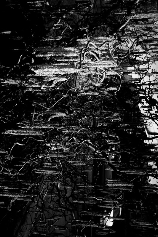
In processing this image, I was playing with the idea of DNA running across a gel. It was a lab exercise I did in high school chemistry. My memory is a bit foggy, but if I remember correctly, DNA is negatively charged, and traveled across to the positively charged nodes in the apparatus. It was a really fun exercise. We took poloroids of the results, and this photo reminded me of how the DNA looked after “running” across the gel.