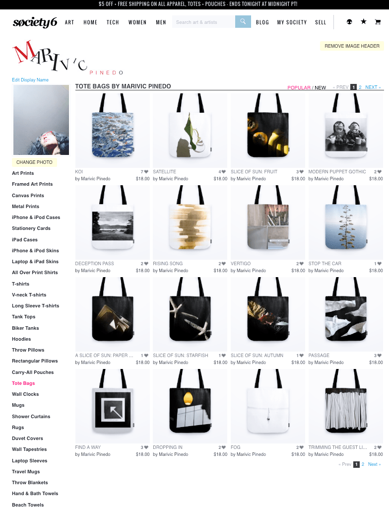
I’ve been working on a project that I hope will help bring in a little extra money. I’ve joined a legion of other artists on Society6, where my work is available for sale in the form of prints, canvas art, tote bags, shower curtains, duvet covers, phone covers, tapestries, clocks, and more. The great thing is that they do all the production and shipping, and I simply upload my work. For every item sold I get some profit from it. I get a kick out of seeing my work transform into different shapes, sizes, and textures.
Feel free to share this link through your social media!
p.s. If there is something of mine that you like but don’t see it as an item for sale, just let me know and I’ll consider uploading it. Have fun shopping!
The other day, I took a trip to the local Fisherman’s Terminal to pick up some salmon for dinner, and thought it might be fun to do a short photowalk through the shipyard. September has been cool and sunny, and the light gentle, yet intense. It turned out to be a meditative escape in a playground of shapes, texture, color, and light.
—
Sometimes I think I can take photographing for granted. With easy access to any kind of camera, we can capture what we want when we want. It’s easy. It’s fast. It can sometimes be more of a reactionary response, or a “this might look good” moment. I don’t discourage myself from just shooting because sometimes those moments turn out really well. Some of my favorite images are things I caught by luck or random happenstance. But the amount of snap-shot/just because photos I have can totally burn me out. I tend to get bored and frustrated. Where is the work I’m dying to make? The work that really stands out for me that isn’t just another random image? That’s when I realized: My mind is not always in it’s prime state when taking photos. Simply put, there are times I am present with my camera and the moment, and there are times when I am not. I want to strive to be more present. Not only is this healthier for my mind, it yields my more thoughtful and impactful images.
As I continued my walk through the shipyard, I felt every step on the wooden pier, took a breath and stabilized my feet before every shutter release, thought about how a subject might look at different angles, remembered to consciously practice things I learned in school like hyper-focal distance focusing, and visualized how I might want to process a moment differently than how I saw it at that moment. I was patient with myself. I let myself try. It was one of my more immersive photo walk experiences. I was eager to edit what I had shot, because I knew I had good things to share.
Bands | Sep 2016 | Marivic Pinedo Materialize | Sep 2016 | Marivic Pinedo Koi | Sep 2016 | Marivic Pinedo Streak | Sep 2016 | Marivic PinedoSo, I’d like to ask you: What intention (if any) do you set for yourself when you go out shooting? When do you think you feel disconnected from your work? When do you feel connected with your work? Do you practice a sort of mindfulness when you are shooting? And just for fun, where are some places in your hometown that you can always go to to explore your creative seeing? As someone who can struggle with creativity and finding inspiration, I’d love to hear your thoughts!
In high school, before digital, we shot black-and-white film. It was a meditative practice. Five years ago I took some photography classes and one of my instructors was an incredibly passionate and experienced photographer. No-nonsense, hard-core, bad-to-the-bone master printer, Jhanavi Lisa Barnes taught us the zone system and helped us understand highlights and shadows. How to accomplish these things in-camera (film), and later on in the darkroom. There is nothing like a print that comes from film and developed on paper. I do miss the luxury of it, and have a total respect and appreciation for the process. (Alas, I’m an impatient type. Also, the cost of purchasing film, paper, facilities rental, gas, parking, etc. just isn’t economical or convenient).
So, how do you visualize, take, and process an image so that it looks like it imbues the tonality and contrast of black and white film? I continue to hone and refine my skills in digital photography, and feel I have a good grasp on how to adjust tone, saturation, and highlights through the various color channels and tone curves. I push myself through the grey of an image. With the Zone System in mind, I work to keep, but not blow out, my highlights. I nudge my shadows, blacks, and exposure sliders to keep the shadows from becoming too muddy. However, if I’m going for a specific style, I will push the highlights and/or muddy the contrast if it communicates the feeling I want for it to radiate. Finding balance in the light is something I love to work with.
Here’s a little slide show of people and places where I’ve worked the light to suit the image captured; keeping in mind the feelings I remember having when developing black and white prints.
In converting this, I wanted to make sure most of the details of the coffee shop were preserved, and the edges of everything were crisp – a documentary approach.Caught mid-morning, it was important to me to define the window shapes. I also wanted the light on the carpet, mat, and door to radiate in a glow, by slightly boosting the light on the grain and fibers. The slight vignette was used to not only help emphasize that glow, but bring about the feeling of the dark hallway environment.I looked down and saw these logs and new I wanted to capture it for its texture against the sand. The metal of the fire pit added another textural element. The sand at the beach is probably closer to a middle-grey, but I wanted to darken it by sliding the appropriate color tones to the darker side, drawing your eye more toward the lines in the wood.Aftera bit of a car ride and wait at the border,I almost missed seeingNon-Sign II at the U.S. and Canada border. I snapped this quick with my smart phone. It isn’t technically good, but I had this idea of processing it like an Andrew Wyeth painting, taking advantage of chunky texture, dramatic clouds above, and dry grass in the foreground.Intentionally stark and high in contrast. I will probably add this to my abstract collection to show at a cafe near you.It was a grey day at the park. While processing this, I was going for duller highlights and grain to have a Kodak TMAX film look. He had been running around, and had just dived into his cake before this was taken.This red-head is a favorite. But why process that color away by making it black-and-white? Well, because it’s challenging, to balance fairness and red/orange hair. Her eyes are blueberry blue, so I did a spot adjustment to lighten them up to complement her complexion.My current muse. Not mine, but so easy to photograph. I wanted to deepen this playful pose, bringing out the folds and wrinkles, and darkening the carpet to draw more attention to baby’s face.Window light is the best. I think I was going for a People magazine portrait style.I was asked to take some informal portrait for an online directory. Taken at dusk with no flash. I thought a light beige or grey would work well and wouldn’t be in high contrast with her skin tone. The texture in the brick on this very light grey wall was just enough to have that balance I was looking for. And I was further able to draw that out in Lightroom.My head was thinking “Post-college 1990s by the beach”, but in black and white. I’m not sure I captured that here (It looks far too digitally sharp), but I do like how I worked out the various blue tones (sky and ocean), so it didn’t all blend together too much.Selfie. This image is way more grey than it is here. I remembered how I felt this autumn day after just getting these new eyeglasses. Thick overcast gave me a diffused lighting in my car park. I blasted the heck out of the white while processing and I smoothed the noise out, considerably.Complete opposite. I wanted to retain my mid-beige skin tone and make sure the hint of light from the skylight above me could be seen in hair. I darkened the carpet to help with framing, and wanted to retain the quiet and calm I was feeling but not going to extreme with contrast.
Food photography is a fun and leisurely activity for me, and is usually done with my smart phone. I was recently given the opportunity to submit some photos and write a post about my Filipino Chicken Tinola Recipe (Tinolang Manok). It’s now up and published on my good friend Caroline’s food blog, pickledplum.com.
Here are some pictures of food that I’ve taken over time. I try to be as low maintenance as possible, so I shoot with natural light coming through my kitchen window and onto my black kitchen table.
The Fremont Sunday Market in Seattle is a fun place to walk and peruse art, crafts, vintage goods, and wares. On a hot sunny day, sun blazing overhead, I was feeling experimental. Here, I had fun with exposure. I felt like shooting like how it felt – white hot. I think these would be fun as easy poster prints to hang in a bright kitchen.
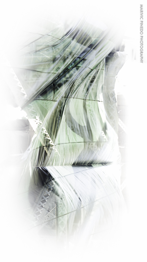
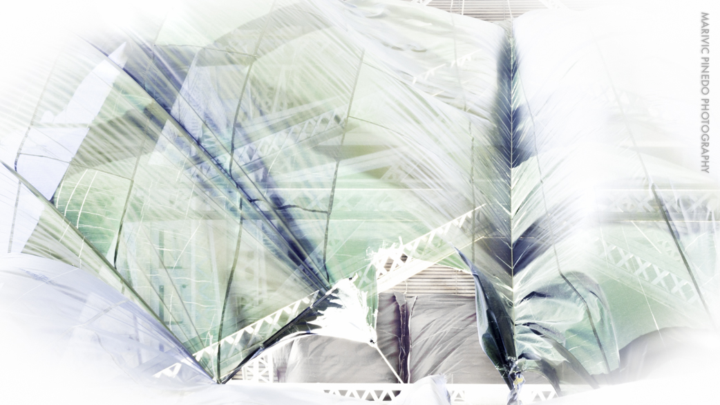
Aye! This isn’t a naughty post. I was hypnotized by the fabric that’s been draped under the Aurora Bridge due to construction. It was catching a strong breeze, billowing and flapping. In post-processing, I got carried away with the sliders, but found these results graphically futuristic.


 rising and falling


")

")